Synopsys
Design Systems

Established three design systems to enhance consistency and accelerate delivery for the Marketing Org.

Role

UX Design Intern
(Full-time)

Discipline

UX Design
Design System

Timeline

May 2023 -
Dec 2023

Team

Creative Team,
Global Marketing
& Communications

Tools

Figma
HTML / CSS
MS Suite

The Background

Transitioning to Figma Since 2022

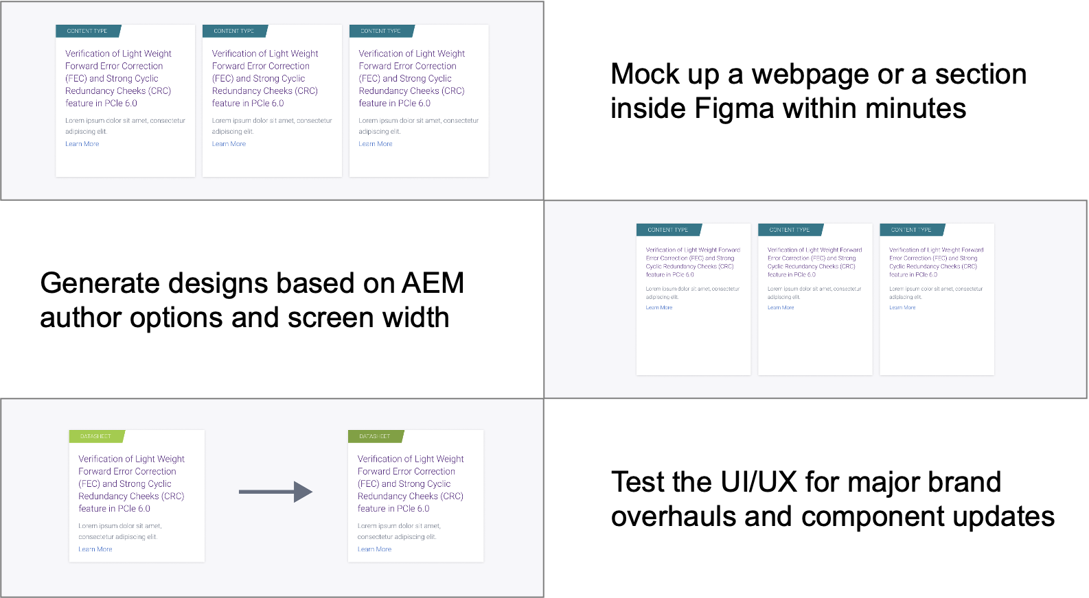
Synopsys, a global leader in chip design, had maintained website designs with design components on Adobe Experience Manager. That changed to Figma.
Before ❌
Now ✅
The Problem

Costly Gaps in Current Workflow

Manual Design Work

The UX team, similar to product designers for a web-staging platform,  crafts authoring interfaces without prebuilt tools.

Development Handoff

Currently, designers create time-consuming detailed documentation in deck formats to articulate nuances like interaction logic.

Undocumented Uses

Some component usages and styling have never been officially documented.

My Contribution

Building Three Design Systems from Scratch

1️⃣ Synopsys.com
Design System

Documenting and dictating all design on global site.

2️⃣ UX Authoring
Design System

Standardizing the webpage authoring interface for 100+ global authors

3️⃣ Design Tokens and Fundamentals

Building design fundamentals for future scalability.

Synopsys.com Design System

Auditing Components' Frontend Behaviors


In my first month as an intern, I identified inconsistent design decisions and unstandardized frontend practices due to the reliance on contract workers.

To address this, I took the initiative to audit 54 existing components, conducting detailed HTML/CSS inspections. Also, I collaborated closely with data scientists and backend developers, gaining a deep understanding of each component's profile.

Usage Data Reference

Identifying High-Impact Components

After cross-referencing monthly usage reports with a backend colleague, I identified a threshold of high-impact components exceeding 8000+ usage across all site pages. These are the components to be build first.

8000+
Component Usages
Design Execution

50+ Versatile Components Built in Figma


Subsequently, I built 50+ components on Figma, utilizing variants, properties, and variables to precisely replicate their functionality on the official site.

Leadership Buy-In

Advocating for a Forward-Facing Workspace


Aware of leadership's focus on growth and efficiency, I emphasized high-level benefits of adopting Figma.

By aligning Figma’s capabilities with the company’s growth objectives, I effectively supported and responded leadership’s vision for the future.

Cross-Team Communication

Detailing the Wins of Figma's Functionality


I strategically communicated the Figma Design System's impact by aligning it with a non-designer's "what's in it for me" mindset.

By highlighting streamlined workflows, cost efficiency, and a unified brand presence, I demonstrated how the system supports organizational goals, fostering alignment and driving the "One Synopsys" vision forward.

UX Authoring Design System

Replicating Authoring UX in Adobe AEM

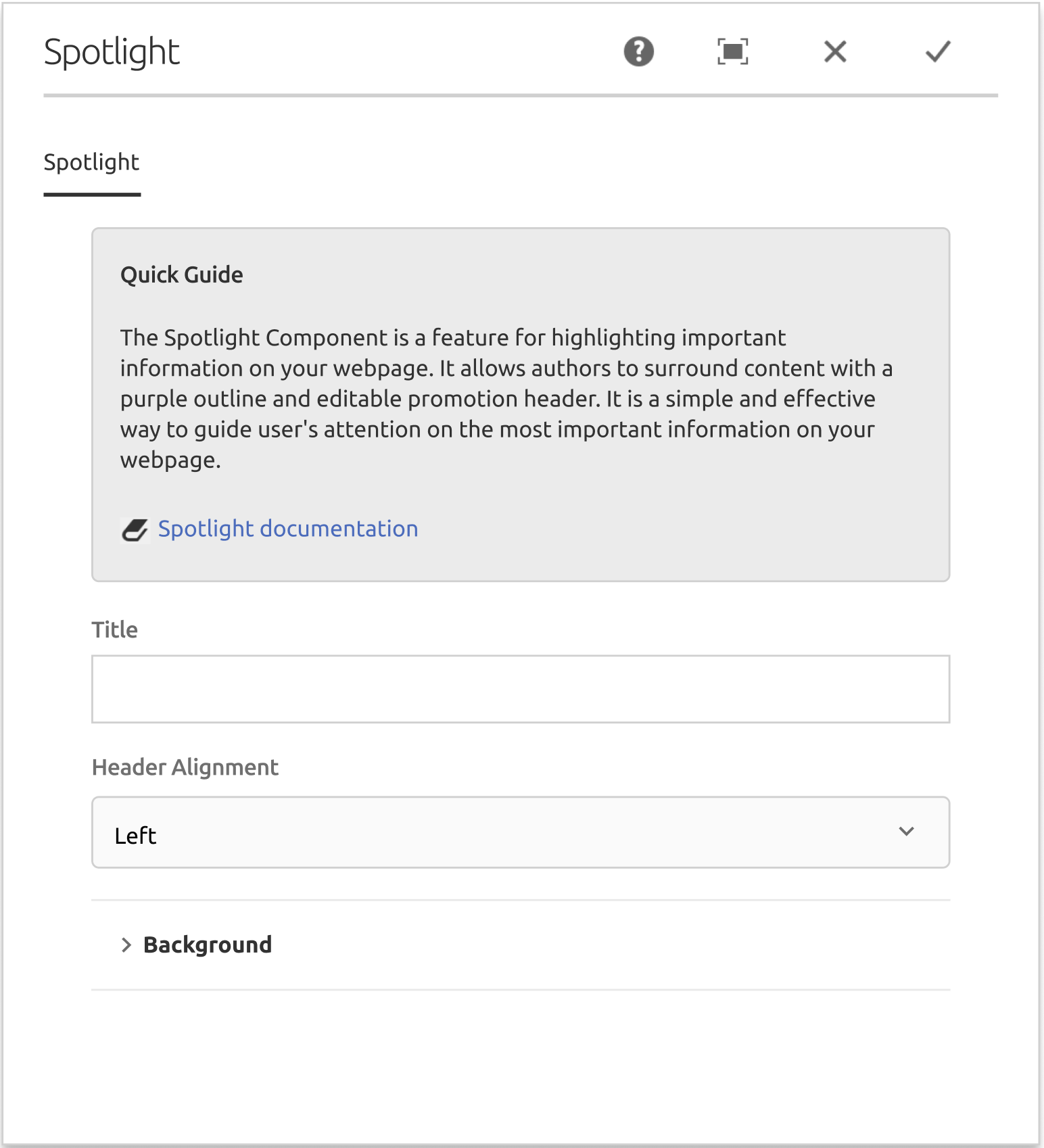
I examined a Figma design system replicating the Adobe Experience Manager (AEM)'s authoring user experience, Synopsys's chosen content management system. From there, I audited current UI components, identified 30+ to develop, and mastered component creation logic.

The Result

Reducing Component Delivery Time by 80%

Before
My manager spends 1~2 hours copying and pasting on Figma for a new component concept

After
I powered a 1~2 minutes drag-and-drop workflow that gives back time for the creative team

Design Foundations and Tokens

Extending Impact Beyond Summer

Building on the momentum of my summer internship, I continued my UX journey into Fall 2023, driven by a desire to further develop and implement design system fundamentals across multiple projects.

Refining Core Design Element

My work focused on refining crucial aspects like color tokens, accessibility testing, and spacing, where I transitioned from a 5-point to a 4-point system, ensuring consistency and improved user experience.

Documenting and Standardizing Components

In this V2 iteration, I further fleshed out my workflow by meticulously documenting website components in use. I built these components from clear guidelines for typography and design, providing a solid foundation for future design work.

Closing Thoughts

A Summer of Growth and Friendships

In this internship, I learned to be adaptable and flexible to meet the needs of users, stakeholders, and my team members. I also understood what it was like to work within timeline and budget constraints to meet deadlines.

To my sponsored trip to Figma's "Coachella for designers" conference, and to my illuminating whiteboard sessions with colleagues; To a warm welcome gift from my manager, and to the forever blooming roses in this South Bay summer.

Manager's Testimonial

"Cass has far exceeded our expectations in a great way"

[Excerpt from my intern success story]:

Cass's dedication and the quality of her work were highly praised by her colleagues. Branden FitzPatrick [my manager], a colleague, noted, "Cass has far exceeded our expectations in a great way."

"This token concept we plan to use to enforce brand consistency is something that's very important to our plan to improve the experience of our website and other digital properties."

Continue Reading

Home Energy Watch

An AI-powered dashboard that helps homeowners understand energy consumption and optimize carbon footprint

Continue Reading

Ursa Technology

Guided learning features on the internal coding terminal for K-12 coders of an international EdTech company